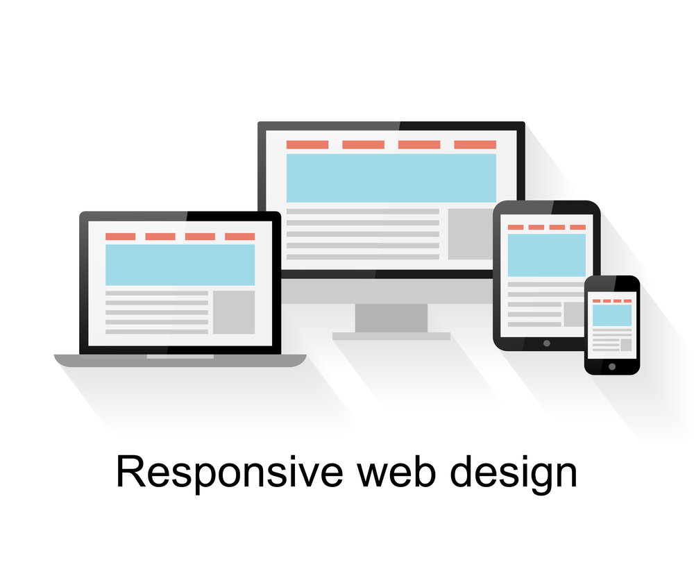
Responsive web design supports mobile-first SEO by ensuring your website’s content, navigation, and technical elements remain accessible and usable across mobile devices. When Google primarily evaluates the mobile version of your website for indexing, a poorly optimized mobile experience can make it harder for both users and search engines to access important content.
Key Takeaways
- Strengthen mobile SEO: Keep important content and technical SEO elements consistent across mobile and desktop
- Improve mobile performance: Optimize Core Web Vitals, loading speed, and responsive interactions
- Protect search visibility: Ensure Google can crawl, render, and understand your mobile content
- Enhance user experience: Build responsive, touch-friendly, and bilingual experiences for UAE audiences
Web traffic in the UAE is largely driven by mobile devices. So, if your business has rigid and non-responsive website layouts, then chances are that you are quietly losing visibility and potential conversions from mobile users.
2025 data shows that smartphones accounted for 78.67% of all web traffic in the UAE. And as of early 2026, the UAE had 22.1 million active cellular mobile connections, equivalent to 195% of its 11.4 million population, highlighting the country’s exceptionally high mobile penetration. So, if your website is not built responsively, you are optimizing for a shrinking minority of your actual audience.
Google’s mobile-first indexing makes this even more important because Google primarily uses the mobile version of a website’s content for indexing and ranking.
How Mobile-First Indexing Works for UAE Businesses in 2026
Gone are the days of Google ranking your website based on its desktop layout! Google’s smartphone crawler today primarily evaluates the mobile version of your website for indexing and ranking.
Recent tracking by Statcounter for 2026 confirms this permanent shift, showing that mobile devices hold over 55% of the overall device market share in the UAE, while desktop usage continues to shrink. This automatically indicates that you should now consider responsive design as your top priority. Why? Because your mobile experience is now an important part of how both users and search engines access your website.
For businesses investing in responsive web design in Dubai, this mobile-first approach also means ensuring that the website’s structure, content, and user experience work effectively across different mobile devices.
| Metric | Responsive Website | Non-Responsive Website |
| Mobile layout | Adapts to different screen sizes | Often designed primarily for desktop |
| Content visibility | Consistent across devices | May become difficult to access |
| Navigation | Designed for touch interaction | Often requires zooming or excessive scrolling |
| SEO management | One website and URL structure | Can require more complex configurations |
Table: Responsive vs. Non-Responsive Website Design for Mobile SEO
The Role of Google’s Smartphone Crawler in UAE Search Rankings
Wondering how Google’s smartphone crawler works? It basically renders your pages using a smartphone user agent so Google can access and evaluate the mobile version of your content.
So, if key content in the pages is hidden or broken or missing on mobile, Google may not have access to the same information available on the desktop version.
The important point is not simply whether your website “looks responsive.” Your mobile version should contain the important content, links, metadata, and structured data that Google needs to understand the page.
| 📌 Important Note: Responsive design alone does not guarantee strong mobile SEO. Always check whether important content and SEO elements remain available on the mobile version. |
Mobile Website Containing the Same SEO Content as Desktop
This is one of the most important checks to make when moving to a mobile-first indexing approach.
Make sure your mobile version retains:
- Primary page content
- Important headings
- Internal links
- Relevant images and alt text
- Title and meta information
- Structured data where applicable
This becomes particularly important when redesigning or developing a website, because changes made to the mobile interface can sometimes affect content structure, navigation, or important SEO elements. Lubnanona approaches responsive website development with both user experience and search visibility in mind, helping businesses create mobile-ready websites without compromising important SEO elements.
High Smartphone Penetration and Mobile Search Expectations in the GCC
If reports are to be taken into account, UAE users spend an average of 8 hours and 36 minutes online daily, with a significant share of that time on mobile devices. In fact, independent industry tracking via Euromonitor International’s latest retail reporting reveals that more than 75% of all online purchases in Dubai and the wider UAE are now completed on mobile devices. That volume of mobile usage automatically sets a high bar for speed and usability that non-responsive websites simply cannot meet.
For UAE businesses, this means mobile SEO needs to focus on more than screen size. Speed, navigation, readability, and ease of interaction all matter when customers are searching and converting from their phones.
Why Are Core Web Vitals Crucial for Responsive Website Performance?
Real user experience, load speed, visual stability, and responsiveness to interaction – these are measured by Core Web Vitals. These metrics help businesses understand important aspects of the mobile page experience and identify areas where performance can be improved.
Optimize Largest Contentful Paint (LCP) for Fast Mobile Load Times
Compress images, serve assets through a regional CDN, and minimize render-blocking resources to keep your largest visible element loading quickly on mobile connections.
Even with the UAE’s strong average mobile speeds – which were ranked as the fastest in the world by the Ookla Speedtest Global Index in 2025, boasting median download speeds of over 667 Mbps – unoptimized assets can still push LCP past acceptable thresholds.
| 💡Expert Tip: Test LCP specifically on throttled 4G conditions, not just your office Wi-Fi, since real-world mobile performance in busy urban areas can differ significantly from ideal lab conditions. |
Eliminate Layout Shifts (CLS) Across Adaptive Screen Sizes
Reserve fixed space for images, ads, and dynamically loaded elements so content doesn’t jump around as a page loads. This is especially important across the wide range of device sizes UAE users browse from, spanning both iPhone and Android devices.
Enhance Interaction to Next Paint (INP) for Instant Touch Response
Reduce heavy JavaScript execution that delays how quickly a page responds to a tap or scroll. Slow interaction response can create unnecessary friction for mobile users.
How UAE Brands Ensure Progressive Web Apps (PWAs) Are Search Indexable
An improperly configured PWA can be effectively invisible to Google, no matter how well it performs for users who already have it installed. So, the key is to get the underlying technical structure right so that important content remains accessible to search engines.
Implement Canonical Tags and Clean URL Architectures for App Pages
Ensure every meaningful screen within your app has a clean, indexable URL and a correct canonical tag. Avoid duplicate content issues between app views and web pages covering the same content.
Configure Dynamic Rendering and Server-Side Rendering (SSR)
App screens heavy on JavaScript can be difficult for Google to fully render. Server-side rendering or other suitable rendering approaches can help ensure important content is available to search engines without relying entirely on client-side JavaScript.
Enable Schema.org Structured Data Across Mobile App Interfaces
Adding relevant SoftwareApplication schema markup can help Google understand software application pages when the markup accurately represents the visible content. This naturally supports a richer and more accurate search result presentation.
How Mobile App Indexing and Deep Linking Bridge Organic Search with Native Apps
Running both a native app and a mobile website? Deep linking is what you need to connect the two. This enables search traffic to land users directly inside the app experience rather than a separate web version.
However, deep linking should be treated as an extension of the web experience, not a replacement for mobile-first indexing. Google uses the corresponding web page content for Search indexing and ranking.
Configure Android App Links and iOS Universal Links for Direct Search Routing
Mapping web URLs directly to native app screens allows high-intent searchers to open directly into your app, rather than a browser, improving both engagement and conversion.
Synchronize Web Content and Native App Screens for a Consistent Search Experience
Keep content parity between your mobile web pages and native app screens. The app experience can look different, but the corresponding content should remain consistent so users arriving through Search receive the information they expect.
How Responsive UI/UX Influences Mobile User Experience
Responsive design directly influences how easily users can navigate, read, and interact with your website on mobile devices. A frustrating mobile experience can cause users to abandon pages or fail to complete important actions, reducing the value of otherwise successful organic traffic.
Reduce Bounce Rates Through Touch-Friendly Navigation
Ensure buttons and links are appropriately sized and spaced for thumb navigation, reducing accidental taps and frustration that drive users away quickly.
Improve Mobile Engagement with Adaptive Bilingual Layouts
It is not a mere courtesy to support both English and Arabic with proper right-to-left CSS logic. This is necessary because it directly expands the pool of UAE search queries your website can serve effectively.
For Arabic audiences, responsive design should also account for RTL navigation, typography, spacing, forms, and buttons, and not simply translated text.
| 🇦🇪 UAE-Specific Tip: Test both English and Arabic versions on mobile devices. A layout that works perfectly in English can behave very differently when content switches to Arabic and RTL. |
For UAE businesses serving both audiences, this makes bilingual UX an important part of responsive website development, not an afterthought added after the design is complete. Lubnanona’s web and UX development services can help businesses build mobile experiences around different audiences and usability requirements.
What Other Technical Checks Matter for Mobile SEO
Security signals are now baseline expectations for strong page experience and not optional extras.
Enforce SSL/TLS Certificates and HTTPS Protocol for Mobile Data Protection
Every page, including app-linked screens, should run on HTTPS. This satisfies both Google’s page experience criteria and general UAE data protection expectations for handling user information securely.
Eliminate Interstitial Pop-ups and Intrusive Overlays
Design consent forms and promotional banners so they do not block content on smaller mobile screens. Intrusive interstitials are often known to work against mobile page experience signals.
Other quick checks include:
- Check that important mobile resources can be crawled
- Verify canonical tags and internal links
- Ensure important content is available without unnecessary user interaction
- Check structured data on the mobile version
- Review mobile SEO performance and Core Web Vitals
How to Measure Mobile SEO Performance
A responsive redesign should be measured by more than how good the website looks on a phone.
Track:
- Mobile organic clicks and impressions
- Core Web Vitals
- Mobile rankings
- Indexed pages
- Organic leads or sales
Use Google Search Console and PageSpeed Insights alongside your analytics data to compare performance before and after major mobile improvements.
For businesses planning responsive web design in Dubai, these measurements can also help establish whether improvements to mobile usability are translating into stronger organic performance and conversions.
Mobile-First SEO Readiness Checklist☐ Test responsive layouts across major mobile screen sizes☐ Check that important content is consistent across mobile and desktop ☐ Test LCP, CLS, and INP ☐ Verify important mobile resources can be crawled ☐ Check canonical tags and structured data ☐ Test English and Arabic mobile layouts where applicable ☐ Review intrusive pop-ups and mobile overlays ☐ Monitor Search Console performance after major design changes |
Final Thought
Aligning your website’s responsive design with Google’s mobile-first indexing approach is essential for creating a mobile experience that is easy for both users and search engines to access.
By prioritizing responsive layouts, mobile content parity, page speed, bilingual UX, and technical SEO, regional businesses can strengthen their mobile experience and create a stronger foundation for organic search visibility.
Ready to Fix Your Mobile SEO?
Is your website’s mobile experience affecting usability or organic search performance?
Lubnanona helps UAE businesses improve responsive web design, mobile UX, technical SEO, and page performance to create websites built around how customers actually search and browse.
Contact Lubnanona today for a responsive web design Dubai consultation and a full mobile-first indexing audit.
Frequently Asked Questions(FAQs)
1. How Much Will a Responsive Web Design Cost for a Dubai Business?
The cost depends on the website’s size, CMS, number of pages, integrations, bilingual requirements, and whether the project is a redesign or a new build. A basic business website typically requires less investment than an e-commerce or highly customised platform.
2. How Long Will It Take to Make My Existing Website Responsive?
A simple business website can often be adapted within a few weeks. But if it is a larger website with custom functionality, multiple templates, or third-party integrations, it may take longer.
3. Will a Responsive Website Improve My Local SEO in Dubai?
Responsive design can improve the mobile experience for users searching locally, but it does not by itself guarantee higher local rankings. Local SEO also depends on factors such as Google Business Profile optimisation, relevant local content, reviews, and location signals.
4. Should I Have a Separate Mobile Website Instead of a Responsive Website?
Not necessarily. For most businesses, a responsive website is the simpler approach because the same website and URLs adapt to different devices. A separate mobile site can introduce additional SEO and maintenance requirements.
5. Does Responsive Design Matter if Most of My Customers Come through WhatsApp?
Yes. Customers may discover your business through Google and then visit your website before starting a WhatsApp conversation. A mobile-friendly website can make that journey easier and reduce friction before the enquiry.